The Challenge
Fetchly was going through a visual and verbal "identity crisis". With no clear guidelines, every team — sales, product, social media — spoke a different language, diluting the brand's authority in the market.
There was no central asset repository either, which meant constant rework on even the most basic materials. Every deck, email, and social post had its own identity, making consistent brand recognition impossible.
Fragmented Identity
Without brand guidelines, every piece produced by the teams had a completely different visual style and tone of voice.
No Asset Repository
With no central library, every new piece had to be built from scratch — wrong logo versions, inconsistent colors, mismatched typography.
Incoherent Communication
Sales, product, and marketing described Fetchly's value in different — sometimes contradictory — ways to clients and partners.
Execution Speed
The lack of standards made content production slow and expensive, keeping the team from moving at startup speed.
Solution
I used my hybrid background in Design and Journalism to create more than a visual guide: a Messaging Architecture — a system that defines not only how the brand looks, but how it speaks.
The approach started from one premise: visual identity and brand voice are inseparable. A beautiful logo without a clear message is just aesthetics. The solution had to unify both.
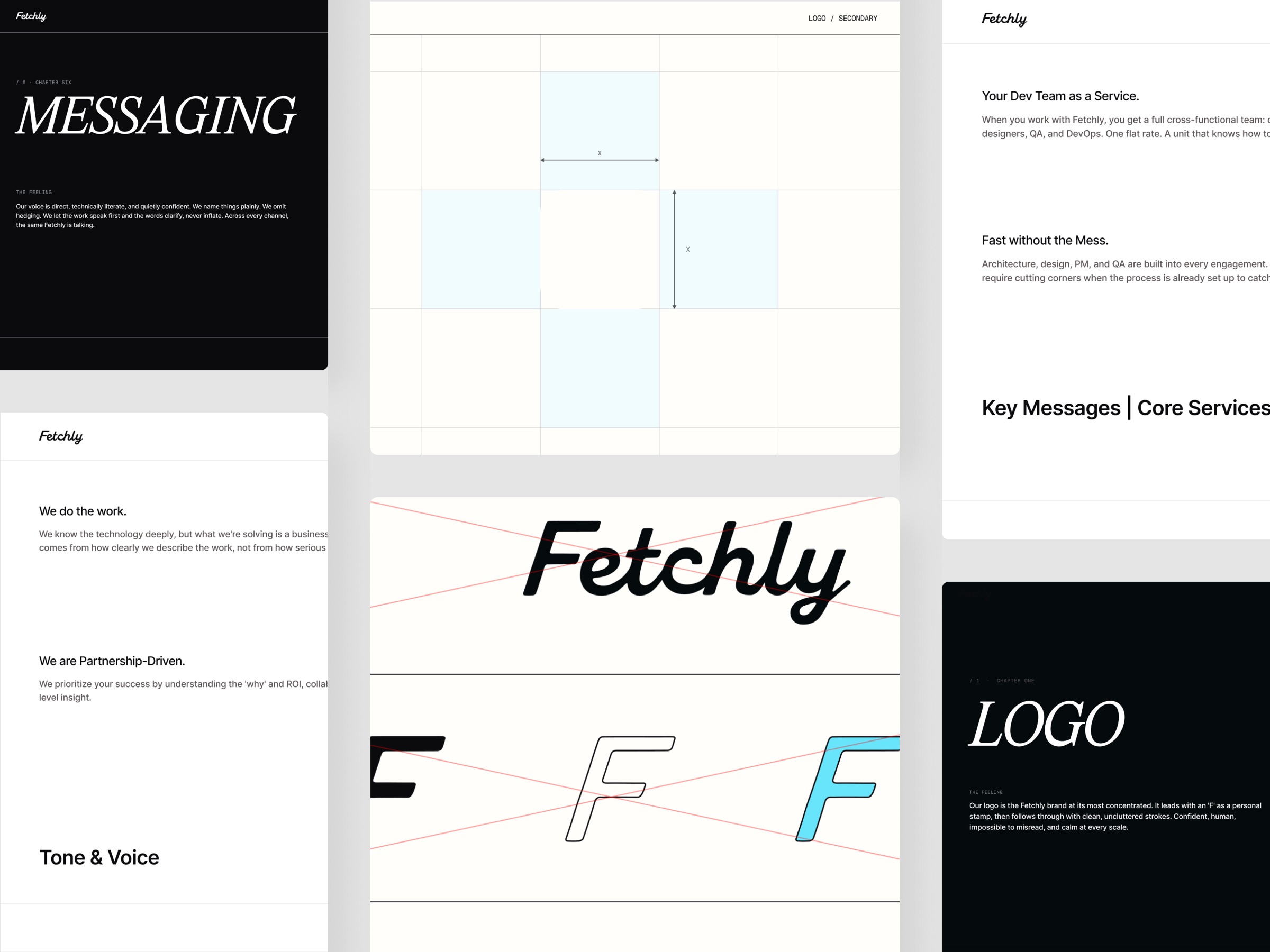
Selected pages from the Brand Book: the Messaging Framework and Brand Voice & Tone sections.
Deliverables
Visual Identity
Logo in every version and correct usage, color palette with defined tokens, hierarchical typography, grid, and iconography — all consolidated and documented.
Brand Voice & Tone
Definition of the "Transparent & No-nonsense" pillar: results-driven communication without excessive jargon. Includes examples of how to write in different contexts.
Messaging Framework
Proprietary vocabulary and messaging architecture: how Fetchly positions itself, which words to use and avoid, and how to adapt the message for different audiences.
Asset Repository
Centralized library of every visual asset organized by category, with clear do's and don'ts for each element.
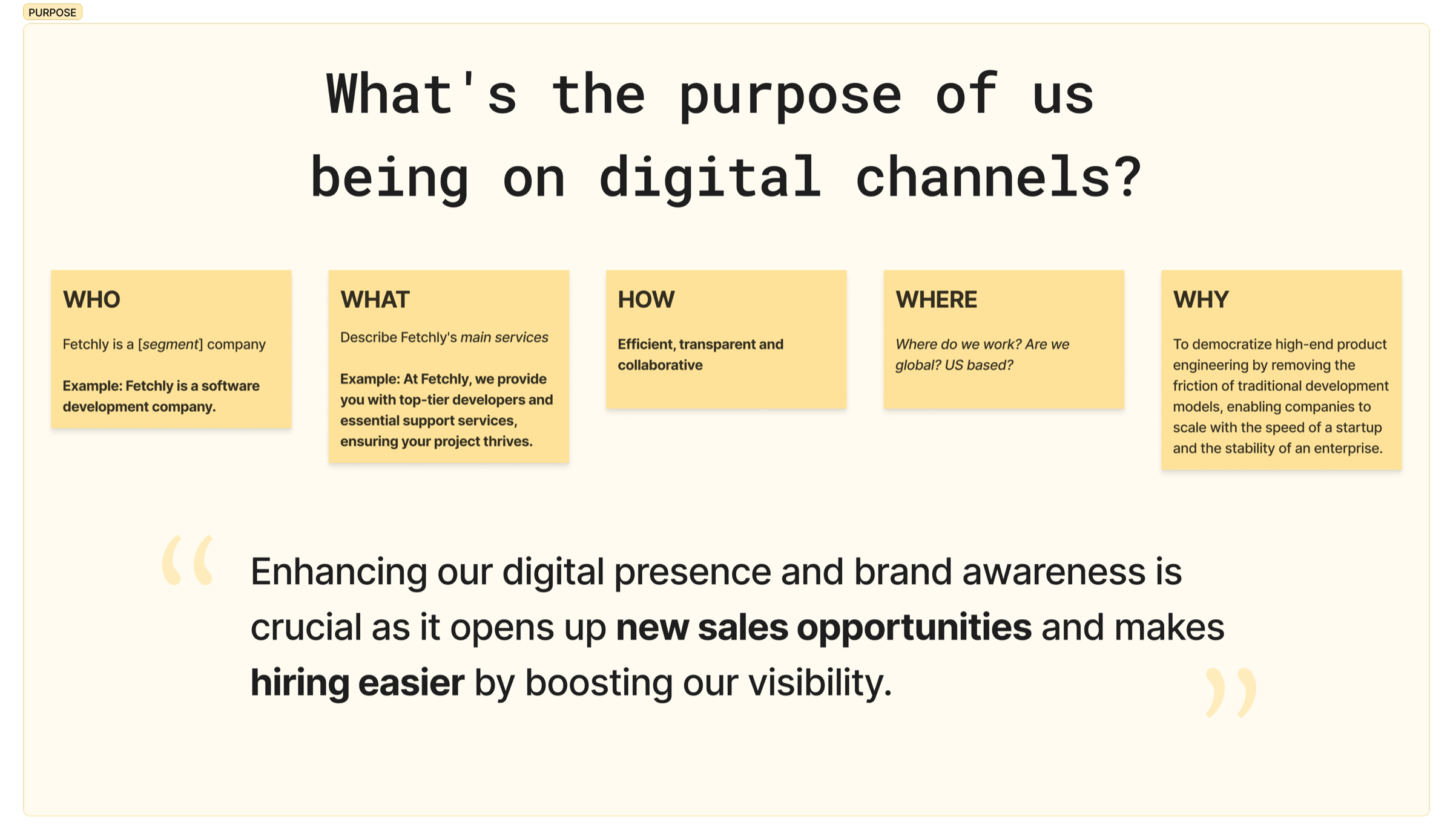
The Messaging Framework: proprietary vocabulary and Brand Voice & Tone guidelines that unified communication across every team.
Results
The impact was immediate and measurable. Beyond visual standardization, the main result was execution speed — the metric that matters most to a startup.
| Category | Result |
|---|---|
| Speed | 7 pieces of strategic content published in under 3 weeks after the brand book launch — with zero rework. |
| Consistency | Every team began producing materials with a cohesive identity, regardless of who created them. |
| Brand Authority | A professional, unified presence made it easier to win new partners and clients, who started seeing Fetchly as a structured company. |
| Scalability | The system was designed to grow with the company: new teams and new content formats can be added without breaking consistency. |
"The brand gained a cohesive, professional presence — the most effective design is the one that doesn't look like design, it looks like the company."